Scaler's live learning environment.
Concentration isn't shaped by a feature alone; attention wanes for a variety of reasons
Concentration isn't shaped by a feature alone; attention wanes for a variety of reasons
External interruptions are naturally unpredictable, so I focused on the area where the platform has direct influence: managing on-screen noise.
Rather than simply counting down time, the feature could help protect that session from avoidable disruptions. I made one key assumption here: students choosing to use it already had an intention to concentrate. The goal wasn't to force attention, but to support those who had decided to focus. How might we help students manage distractions during live sessions?
Entry point
One of the key considerations was the entry point for Focus Mode. High discoverability was essential, so I opted for a prominent header placement rather than burying it inside a secondary menu.
Consider this scenario— a student wants to mute platform popups and set a study timer for their current class. In terms of user experience alone, this action controls the session on a global level, so the trigger should live in the top navigation bar where it applies to the entire classroom.
Entry point
One of the key considerations was the entry point for Focus Mode. High discoverability was essential, so I opted for a prominent header placement rather than burying it inside a secondary menu.
Consider this scenario— a student wants to mute platform popups and set a study timer for their current class. In terms of user experience alone, this action controls the session on a global level, so the trigger should live in the top navigation bar where it applies to the entire classroom.
(T to B) Entry point buried in contextual side panels; Prominent global header placement.
Setting up a focus session
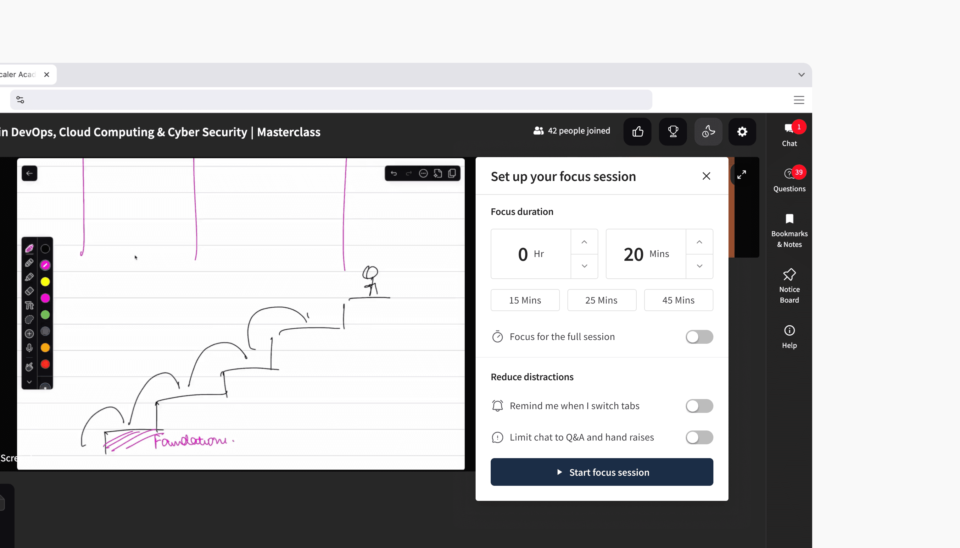
Before starting, users can match the tool to their personal study cadence. Instead of imposing a single rigid approach, the setup overlay balances structured presets—such as Pomodoro-inspired intervals—with customizable durations and flexible distraction-blocking toggles.
Setting up a focus session
Before starting, users can match the tool to their personal study cadence. Instead of imposing a single rigid approach, the setup overlay balances structured presets—such as Pomodoro-inspired intervals—with customizable durations and flexible distraction-blocking toggles.
Choose a duration and configure distraction controls.
Active State
Early prototypes included controls to adjust durations on the fly. I worked under the hypothesis that allowing mid-session changes defeats the point of committing to a focus block. Stripping away controls during the active state streamlined the feature to its absolute essentials to enforce that boundary.
Active State
Early prototypes included controls to adjust durations on the fly. I worked under the hypothesis that allowing mid-session changes defeats the point of committing to a focus block. Stripping away controls during the active state streamlined the feature to its absolute essentials to enforce that boundary.
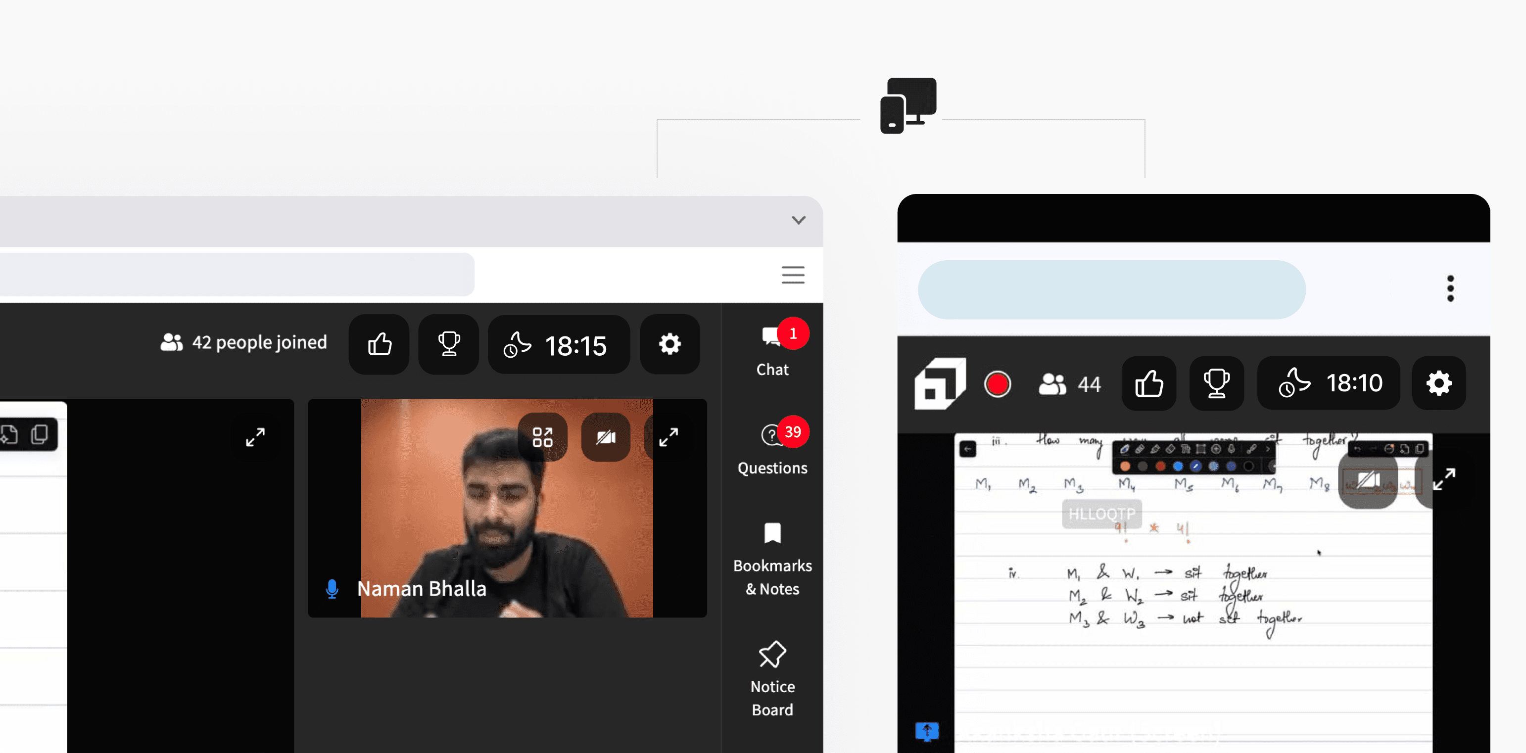
Additionally, in an interface already displaying multiple time-based metrics, a bare numerical readout (e.g., 20:00) risks confusion with elapsed time or recording status. Pairing the countdown directly with a distinct Focus Mode icon establishes immediate visual clarity.
Cross-Platform Continuity
I initially experimented with a compact icon layout for smaller screens, but the visual contrast caused it to pop and pull focus away from the live lecture. Shifting back to the desktop countdown pill proved to be the right move—subsequent testing confirmed that the consistent, low-profile pill kept visual distraction to a minimum on both screens.
Reusing this pattern allowed me to maintain identical setup flows and interaction logic across both desktop and mobile, ensuring a unified, platform-agnostic experience while respecting mobile screen constraints.
What if a focus session didn't end when a student switched from laptop to phone? Observing mid-class device handoffs made it clear that continuity matters. Real-time state synchronization keeps the active countdown running seamlessly across screens, preserving their exact session progress.
Completion
Upon hitting zero, the timer briefly animates to confirm completion before transitioning back to its initial state—ensuring an uninterrupted flow without forcing immediate interaction. Light haptic feedback provides a subtle tactile cue on supported devices.
Completion
Upon hitting zero, the timer briefly animates to confirm completion before transitioning back to its initial state—ensuring an uninterrupted flow without forcing immediate interaction. Light haptic feedback provides a subtle tactile cue on supported devices.
Since attention can't be measured directly, I'd evaluate Focus Mode through activation rate, session completion, repeat usage across future classes, and post-session feedback to understand both adoption and perceived value. One opportunity I'd be excited to explore next is integrating it with Scaler's existing leaderboard, rewarding consistency across classes and encouraging students to build stronger study habits over time.
Conclusion & Learnings
Designing Focus Mode was an intentional effort to address a critical touchpoint in the student journey: the exact emotional shift when a student feels overwhelmed by on-screen noise and decides to lock in. Intervening at this specific moment meant balancing quiet, background support with firm boundaries, ensuring the interface respects the student's intent to concentrate.
Despite being a relatively focused feature, it uncovered far more edge cases and product decisions than I initially expected. Thinking through different scenarios reinforced how even simple interactions have wider implications across the broader interface.
While early usability tests with a small pool of students validated the core direction, true validation will come from tracking engagement and drop-off rates across diverse classroom environments post-launch. I’m excited to see the long-term impact this will have on student focus and retention during live sessions.
Thankyou :)
Conclusion & Learnings
Designing Focus Mode was an intentional effort to address a critical touchpoint in the student journey: the exact emotional shift when a student feels overwhelmed by on-screen noise and decides to lock in. Intervening at this specific moment meant balancing quiet, background support with firm boundaries, ensuring the interface respects the student's intent to concentrate.
Despite being a relatively focused feature, it uncovered far more edge cases and product decisions than I initially expected. Thinking through different scenarios reinforced how even simple interactions have wider implications across the broader interface.
While early usability tests with a small pool of students validated the core direction, true validation will come from tracking engagement and drop-off rates across diverse classroom environments post-launch. I’m excited to see the long-term impact this will have on student focus and retention during live sessions.
Thankyou :)